.webp)

.png)


12 Web Design Best Practices That Actually Work in 2025
Here's a statistic to ponder: 94% of first impressions are design-related, yet most websites fail within the first 3 seconds of a visitor landing on them.
The reason?
They're missing critical best web design practices that turn browsers into buyers. Having optimized hundreds of sites across every industry, I've identified exactly what separates websites that convert from those that don't.
Novelty
I've noticed a pattern with 99% of websites I see - they are boring.
Which is fine; there isn't anything inherently wrong with that.
But nothing made a visitor stop scrolling and think, “This feels different" or "this feels premium".
The solution to this is novelty.
What is novelty in web design?
Novelty in web design means adding fresh, interactive, and unexpected design elements that create moments of delight for your visitors. It’s what makes a site feel alive and worth exploring.
The word comes from the Latin novus, meaning “new.”
And that’s the essence of it - delivering something visitors haven’t seen before, something memorable enough to make them stay.
How I am implementing Novelty in website design for myself and my clients?
1. Interactive 3D Elements & Spline Animations
I integrate 3D models and Spline animations that respond to user interaction. For example, I love adding in spline animations or GSAP animations to hero sections that react to mouse movement. These create immediate engagement without overwhelming the user.
Let's take a look at some examples:
- The66th homepage which uses an animation that tracks your mouse
Here is another example where I use a spline animation.
My goal is to keep users engaged on the site by encouraging them to move their mouse and interact with the content, which also benefits SEO.
Subconsciously, people associate these interactive elements with a premium service. Ultimately, if you can't convey a sense of premium quality or show that you invest in your own brand, why would they choose you?
3 Benefits of Novelty in Web Design
1. Grabs attention instantly
Interactive elements like Spline animations hook visitors the second they land. In a world where attention spans are shorter than ever, that first impression is critical.
2. Strengthens your brand identity
Dynamic, modern experiences reflect a brand that’s forward-thinking and premium. I’ve seen clients’ brands feel elevated overnight with the right use of novelty.
3. Drives deeper engagement
Users explore more when they can interact with your site. Whether it’s rotating a product, playing with a 3D element, or triggering subtle motion effects, these micro-interactions keep people moving through the funnel.
Best Practices for Using Novelty
- Optimize for speed and performance – Lightweight, compressed assets are essential.
- Use novelty with purpose – One or two well-placed animations can transform a page. Overloading it will overwhelm users.
- Stay true to your brand – A playful animation suits a creative brand. Subtle, elegant motions align better with luxury.
- Test across devices – What feels seamless on desktop can be clunky on mobile if you don’t optimize. Test. Test. Test.
Common Mistakes When Adding Novelty to websites
- Doing too much too soon
Flooding a site with animations creates visual noise and kills performance. - Adding animations at the end of a project
They work best when planned from the start - not tacked on as an afterthought. - Neglecting mobile users
Heavy 3D assets without proper optimization can tank mobile performance. On webflow I normally set the div block holding the spline animation as "none".
Visual Consistency
Visual consistency remains a cornerstone of effective web design in 2025.
Visual consistency definition
Visual consistency refers to the uniform application of design elements throughout a website, including colours, typography, spacing, and layout. This uniformity creates a cohesive appearance across all pages and touchpoints, making a site instantly recognizable to users.
In essence, visual consistency means using exact colour codes, typography patterns, and design elements that help visitors recognize your brand immediately.
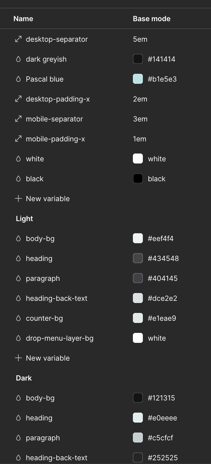
For my webflow site as an example, I use variables with my colours and spacing so I keep things consistent throughout.
Visual consistency benefits
Implementing visual consistency offers several tangible advantages. First, it significantly enhances usability by making interfaces more intuitive which users can quickly recognize familiar patterns and interact without confusion.
Consequently, visitors navigate your site effortlessly, leading to a more enjoyable experience.
Additionally, visual consistency strengthens brand identity. When design elements remain uniform, users instantly recognize your brand across different pages.
This recognition builds trust and credibility by presenting a professional, polished image that shows attention to detail.
Moreover, consistent design shortens the learning curve for new visitors. Once users understand how certain elements function on one page, they can transfer this knowledge to other sections of your site.
Visual consistency best practices
To achieve visual consistency in your web design:
- Establish a colour palette - Use uniform colors across your entire site, especially for primary actions, making it easy for users to identify important buttons or links
- Maintain typography standards - Apply consistent font styles for headings, subheadings, and body text throughout your website
- Implement layout grids - Use grid systems to align elements consistently, ensuring your design remains organized and balanced
- Create uniform spacing - Maintain consistent margins, padding, and alignment for improved readability and esthetic appeal
- Document design decisions - Create a design system with guidelines for colors, typography, and components to ensure all team members follow established standards
Visual consistency common mistakes
Even experienced designers fall into visual consistency traps. Inconsistent updates represent a common pitfall—frequent redesigns can disrupt user experience if not handled carefully. Users become accustomed to patterns, and sudden changes cause confusion.
Neglecting mobile consistency is another critical error. With increasing mobile device usage, ensuring consistency across different screen sizes is essential. Instead of retrofitting desktop designs for mobile, adopt a mobile-first approach to maintain functionality across all devices.
Lack of proper documentation also undermines consistency efforts, especially as teams grow. Without documented guidelines, maintaining visual cohesion becomes increasingly difficult over time.
Remember, as Jakob's Law states, users spend most of their time on other websites, forming expectations for your site based on common practices elsewhere. Deviating from these expectations makes your site harder to use and increases the likelihood of visitors leaving. That being said, my own experience is telling me we are in a shift. We are going to start seeing the raise of storytelling based websites like The66th. Where we walk the us through a story with beautiful visuals.
Typography and Readability
Typography plays a fundamental role in web design, with over 95% of online information presented as text. The way text appears on your website directly impacts how visitors interact with your content.
Typography definition
Typography in web design refers to the art of arranging typefaces and organizing text to create readable, usable, and user-friendly interfaces. Unlike traditional print typography, web typography faces unique challenges and opportunities due to the dynamic nature of digital displays. It encompasses font selection, spacing, line length, and the overall presentation of text across various screen sizes.
Typography benefits
Effective typography dramatically enhances user experience. Primarily, it improves readability, making content easier to scan and digest. Furthermore, it establishes a clear visual hierarchy, guiding users through information in order of importance.
Typography likewise strengthens brand identity through consistent use of specific typefaces and styles, creating a memorable impression in users' minds. Well-designed typography reflects credibility and professionalism, demonstrating attention to detail. Perhaps most importantly, it improves accessibility, ensuring content is available to a broader audience, including those with visual impairments.
Typography best practices
To implement effective typography:
- Limit your font families - Use no more than 2-3 typefaces for your entire website to maintain visual consistency
- Choose compatible typefaces - Select fonts that create contrast while maintaining harmony; pairing a serif with a sans-serif font often works well
- Size text appropriately - Set a minimum font size of 16px for body text to ensure readability without zooming
- Maintain proper spacing - Use adequate line height (approximately 1.5 times the font size) for comfortable reading
- Create contrast - Ensure sufficient contrast between text and background colors; follow WCAG guidelines (4.5:1 for small text)
Typography common mistakes
Despite best intentions, designers often make several typography errors. Overusing font families creates a cluttered, unprofessional appearance and increases page load time. Neglecting mobile responsiveness leads to illegible text on smaller screens.
Poor line spacing makes text difficult to follow, causing eye strain and reducing comprehension. Using all caps for body text significantly slows reading speed compared to lowercase type. Insufficient contrast between text and background colors reduces legibility, particularly for users with visual impairments.
Improper hierarchy confuses readers about where to focus their attention, making information harder to navigate. Additionally, inconsistent letter spacing, especially with all-caps text, reduces readability and creates an unprofessional appearance.
Strategic Use of White Space
White space remains one of the most underappreciated yet powerful tools in modern web design best practices. Often misunderstood as wasted real estate, strategic empty space dramatically elevates your website's effectiveness.
White space definition
White space (also called negative space) refers to the empty areas between and around design elements on your webpage. Despite its name, white space doesn't necessarily need to be white—it can be any color, texture, pattern, or even a background image. This essential design element exists in two forms: macro white space (larger spaces between major layout elements) and micro white space (smaller spaces between individual elements like letters, words, and lines of text).
Think of white space as the breathing room that holds your design together, similar to how silence shapes music. Just as a musician uses pauses between notes, designers use empty space to create rhythm and structure throughout a webpage.
White space benefits
Proper implementation of white space yields several key advantages:
- Improved readability and comprehension - Research shows that correct use of white space in text can increase readability by up to 20%. Furthermore, appropriate paragraph margins and line spacing significantly improve reading comprehension, although they might slightly decrease reading speed.
- Enhanced focus and attention - There's a direct relationship between distance and attention—larger spaces around elements force user focus. By surrounding important elements with white space, you naturally draw the visitor's eye to critical content, reducing distractions.
- Reduced cognitive load - Websites with adequate white space decrease mental effort required to process information. When content feels overwhelming, visitors experience cognitive fatigue and struggle to absorb information effectively.
- Better organization and relationships - White space helps establish visual hierarchy and clarifies the relationship between elements. Items grouped closely together appear related (following the Law of Proximity), whereas those separated by more space seem distinct.
White space best practices
To effectively incorporate white space in your website design:
- Prioritize important content - Use white space strategically to highlight key elements rather than trying to fill every inch of screen real estate. Remember that not everything needs to appear above the fold.
- Balance elements carefully - Too much white space can make a website look empty, yet too little creates visual clutter. Strive for harmony that allows each element adequate breathing room while maintaining cohesive layout.
- Maintain consistency - Establish uniform spacing across your entire website through grid systems or layout guides. Consistent spacing helps visitors understand content structure and navigate more intuitively.
- Consider responsive design - As screen sizes shrink, white space becomes even more crucial. Adjust spacing appropriately for mobile devices to ensure readability on smaller screens.
Color Scheme and Branding
Selecting the right colors for your website isn't merely an esthetic choice—it's a strategic decision that directly impacts user behavior and brand perception. Studies show that people make judgments about products within 90 seconds, with up to 90% of that assessment based solely on color.
Color scheme definition
A website color scheme is a carefully selected set of colors that defines your site's visual identity. Typically consisting of three to five main colors, a complete color palette includes primary colors (used for dominant elements like headers and logos), secondary colors (supporting elements), accent colors (for CTAs and important links), and neutral colors for backgrounds and text. These colors work together to create a cohesive look while reflecting your brand's personality and facilitating intuitive navigation throughout the site.
Color scheme benefits
Implementing a thoughtful color scheme yields measurable results for your business. First, it substantially increases brand recognition—research indicates that consistent color use can boost brand recognition by up to 80%. This recognition builds trust with your audience, as 71% of consumers are more likely to purchase from brands they recognize.
Beyond recognition, color directly influences purchasing decisions. Recent data reveals that 85% of people claim color significantly influences what they buy. Indeed, when companies tested different button colors, some noticed dramatic conversion changes—one projection screen company experienced a 53.1% increase in clicks simply by changing link colors from blue to red.
Furthermore, strategic color implementation can increase revenue by approximately 23% through consistent branding.
Color scheme best practices
To create an effective website color scheme:
- Start with brand personality - Select colors that reflect your brand's core values and evoke appropriate emotions. For instance, energetic brands might use warm colors like orange, while calming brands might prefer blues or greens.
- Apply color theory - Utilize established color relationships:
- Complementary colors (opposites on the color wheel) create visual pop
- Analogous colors (neighbors on the wheel) produce harmony
- Triadic colors (evenly spaced) generate dynamic contrast
- Monochromatic schemes (variations of one color) create elegant simplicity
- Follow the 60-30-10 rule - Allocate 60% to your dominant color, 30% to your secondary color, and 10% to accent colors, similar to major brands like Google and Amazon.
- Consider accessibility - Ensure sufficient contrast between text and backgrounds to maintain readability for all users, adhering to WCAG standards.
- Maintain consistency - Apply your color palette uniformly across all touchpoints—website, social media, packaging, and physical locations—to strengthen brand identity.
Simplified Navigation Menus
Website navigation stands as the backbone of user experience, with research showing that 94% of people consider easy navigation their top priority when visiting a website. This fundamental element can make or break your site's success regardless of how visually appealing other design aspects might be.
Navigation definition
Website navigation encompasses all the methods and elements that help users move through your site and find information efficiently. At its core, it's a collection of user interface components—menus, buttons, and links—that enable visitors to explore content and access features. Functioning as a roadmap, navigation guides users to their destinations while helping them understand the relationships between individual pages.
Navigation benefits
Effective navigation delivers measurable advantages for both users and site owners. Primarily, it increases visit duration as users can effortlessly explore your content. Subsequently, this improved experience reduces bounce rates—crucial for SEO rankings as Google interprets high bounce rates as signs of unhelpful websites.
Clear navigation enhances conversion rates by making it easier for visitors to find what they need and complete desired actions. Furthermore, intuitive menus create positive feelings about your brand, building trust through consistent, helpful experiences. Additionally, streamlined navigation significantly improves mobile user experience, increasingly important as mobile commerce continues its rapid growth.
Navigation best practices
For optimal navigation design:
- Limit menu items - Keep primary navigation to 5-7 items maximum to avoid overwhelming visitors
- Position menus conventionally - Place navigation in familiar locations (horizontal across the top or vertical down the left)
- Ensure mobile responsiveness - Design navigation that works flawlessly across all devices
- Use contrasting colors for links to make them stand out
- Include search functionality - Enable users to quickly find specific content
Navigation common mistakes
Regardless of your design skills, navigation pitfalls are common. Firstly, disregarding conventions creates confusion—users rely on familiar patterns when exploring new sites. Secondly, multilevel cascading menus frustrate users through accidental selections or menu closures.
Hiding navigation (particularly on desktop sites) hinders wayfinding—navigation provides crucial context cues about your site's scope. Finally, vague labeling confuses visitors; use specific, descriptive terms rather than generic ones like "Products".
Remember that unnecessarily deep menu structures force users to click through multiple levels to find information, undermining the goal of simple, efficient website exploration.
Prominent and Actionable CTAs
In the realm of web design, few elements impact conversion rates as directly as calls-to-action (CTAs). While an attractive layout might catch the eye, it's the CTA that ultimately transforms passive browsers into active participants.
CTA definition
A call-to-action is a prompt that encourages website visitors to take a specific action—whether signing up for a newsletter, downloading a guide, or purchasing a product. Typically appearing as clickable buttons or hyperlinked text, CTAs serve as signposts guiding users toward their next steps. These strategic elements create clear pathways through your site, removing decision fatigue by showing visitors exactly what to do next.
CTA benefits
Implementing effective CTAs yields substantial rewards. Primarily, they boost conversion rates by directing visitors toward desired actions. In fact, well-designed CTAs can significantly increase the likelihood that visitors will continue through your sales funnel and eventually convert.
Beyond conversions, CTAs enhance user engagement by encouraging visitors to interact more deeply with your website. This extended interaction helps users become familiar with your brand, building trust that opens doors for future conversions.
Furthermore, CTAs help collect valuable contact information from visitors who aren't ready to engage immediately but may want to in the future. This creates opportunities for nurturing relationships through follow-up communications.
CTA best practices
To create high-converting CTAs:
- Use action-oriented language – Start with strong verbs like "get," "start," "join," or "create" that clearly indicate what users should do
- Highlight benefits – Clearly communicate what users gain by clicking, not just what they're doing
- Create visual contrast – Make CTAs stand out through color, size, and white space
- Ensure proper sizing – Keep buttons large enough for easy interaction (minimum 44×44px for mobile tapping)
- Maintain strategic placement – Position CTAs at logical points in the user journey, especially following compelling content
- Create urgency – Use time-limited offers or scarcity messaging to encourage immediate action
- Test variations – Experiment with different CTA designs and copy through A/B testing to identify what resonates best with your audience
Remember that compelling CTAs aren't just about flashy buttons—they're about creating meaningful connections between users' needs and the solutions you offer.
Responsive Web Design
The multi-device reality of today's digital world demands websites that perform flawlessly across every screen size, from smartwatches to large desktop monitors.
Responsive design definition
Responsive web design (RWD) is an approach that enables websites to automatically adapt their layout, content, and functionality to fit any screen size or device orientation. At its core, responsive design uses three fundamental components: fluid proportion-based grids, flexible images, and CSS media queries. This technique delivers the same HTML code to all devices while using CSS to change how content appears based on the viewing environment. As opposed to creating separate sites for mobile and desktop, responsive design uses a single codebase that works universally.
Responsive design benefits
Implementing responsive design yields numerous advantages for both users and businesses. Primarily, it provides an optimal experience regardless of device, preventing frustration from constant zooming or horizontal scrolling. From a business perspective, responsive sites are significantly more cost-effective than maintaining separate mobile and desktop versions. Moreover, Google actively prioritizes mobile-friendly websites in search rankings, making responsive design crucial for SEO performance.
Higher conversion rates often result from responsive implementation, as consistent experiences across devices build user trust. Additionally, responsive sites future-proof your web presence—as new devices emerge with different screen sizes, your website automatically accommodates them without requiring redesign.
Responsive design best practices
To implement effective responsive design:
- Adopt a mobile-first approach—design for smaller screens initially, then expand for larger displays
- Implement the viewport meta tag (
<meta name="viewport" content="width=device-width, initial-scale=1.0">) to ensure proper scaling - Utilize flexible grids based on percentages rather than fixed pixels
- Set strategic breakpoints (commonly at 480px, 768px, and 1024px) to adjust layouts at key screen widths
- Optimize images for faster loading using techniques like compression and responsive image solutions
- Test thoroughly on actual devices rather than just browser resizing tools
- Focus on performance optimization, particularly for mobile connections
Notably, successful responsive design isn't merely about technical implementation—it requires thoughtful content prioritization for different screen sizes.
Optimized Page Speed
Image Source: VWO
Page load speed has become a critical factor in website success, with studies showing that 40% of users abandon sites that take more than 3 seconds to load. This seemingly technical aspect directly impacts both user experience and your bottom line.
The numbers tell a story.
When loading time increases from one to three seconds, bounce rates jump by 32%. Even more concerning, 53% of visitors will abandon websites that take more than three seconds to load.
Each additional second of delay can reduce conversions by 7%.
The stakes are high, but the solution is straightforward.
By implementing these modern website design best practices, you can create a fast, engaging experience that works across all devices and keeps visitors converting.
Page speed definition
Page speed refers to how quickly your website content loads when a user visits your site. This umbrella term encompasses several specific metrics, including Time to First Byte (TTFB), First Contentful Paint (FCP), First Input Delay (FID), and Largest Contentful Paint (LCP). Each measurement captures different aspects of the loading process—from initial server response to when users can actually interact with your page.
Page speed benefits
The advantages of optimizing page speed extend beyond mere technical improvements. Primarily, faster sites experience dramatically higher conversion rates—studies show that B2B sites loading in one second have conversion rates three times higher than those loading in five seconds. Hence, each additional second of load time significantly impacts your business results.
Above all, improved page speed enhances SEO performance, as Google has confirmed it as a ranking factor for both desktop and mobile searches. Coupled with lower bounce rates (fewer users leaving your site immediately), faster loading times create a positive feedback loop for visibility and engagement.
Page speed best practices
To maximize your website's speed:
- Optimize images - Compress and properly size images before uploading them to reduce file size without compromising quality
- Enable browser caching - Store webpage data temporarily in users' browsers to speed up return visits
- Minify code - Remove unnecessary characters from HTML, CSS, and JavaScript files
- Improve server response time - Upgrade hosting if needed; server location and quality directly impact speed
- Reduce HTTP requests - Minimize the number of elements that require separate loading
Page speed common mistakes
Common errors that slow websites include using uncompressed images, ignoring mobile performance (despite 63% of web traffic now happening on mobile devices), and implementing too many redirects. Specifically, developers often overlook server-side issues while focusing solely on front-end optimizations.
Cross-Browser Compatibility
Building a website that works flawlessly across Chrome, Firefox, Safari, and Edge requires careful attention to cross-browser compatibility—a crucial aspect of modern web design that many developers overlook.
Cross-browser compatibility definition
Cross-browser compatibility refers to a website's ability to function consistently across different browsers and degrade gracefully when browser features are absent. Unlike other web design elements, cross-browser compatibility focuses more on functionality than identical appearance. The goal isn't necessarily to create pixel-perfect replicas across all browsers, but rather to ensure core functionality remains accessible to users regardless of their chosen browser. As long as the essential features work properly, slight visual variations are acceptable.
Cross-browser compatibility benefits
Implementing thorough cross-browser testing yields substantial advantages for your business. Primarily, it ensures a consistent user experience, verifying that visual and functional elements work uniformly across platforms. This consistency increases user retention by reducing frustration, thus encouraging visitors to stay longer on your website.
Moreover, cross-browser compatibility boosts your business credibility by enhancing brand reputation and user trust. Studies show that websites with strong cross-browser functionality experience fewer transaction failures and abandoned carts, ultimately protecting revenue.
Furthermore, proper testing expands your audience reach by making your site accessible to users of various browsers and devices. From an SEO perspective, a fully functional, accessible site aligns better with search engine algorithms, potentially improving your rankings.
Cross-browser compatibility best practices
To ensure seamless browser compatibility:
- Define a comprehensive testing strategy - Identify key browsers and devices based on your target audience's usage patterns
- Prioritize popular browsers - Focus testing on the most-used browser-OS combinations for maximum coverage
- Apply CSS reset techniques - Normalize styling across browsers to eliminate default inconsistencies
- Specify a proper doctype - Include DOCTYPE declarations to ensure browsers interpret pages in standards mode
- Test on real devices - Avoid emulator inconsistencies by testing on actual browsers and hardware
- Leverage cloud testing platforms - Utilize services like BrowserStack for efficient, scalable testing across multiple environments
Website Accessibility Standards
Accessibility has emerged as a core component of web design best practices, with approximately 16% of the world's population having a disability that may affect their ability to use websites. This significant portion of potential users deserves equal access to online content.
Accessibility definition
Web accessibility refers to the inclusive practice of designing websites that everyone can use, regardless of their abilities or circumstances. This approach ensures there are no barriers preventing interaction with web content for people with physical, situational, or socioeconomic limitations. Properly implemented accessibility accommodates users with visual, motor, auditory, seizure, and cognitive impairments.
Meanwhile, accessibility extends beyond permanent disabilities to include situational limitations. Consider someone using a device one-handed while holding a baby—they experience temporary accessibility challenges that thoughtful design can address.
Accessibility benefits
Investing in accessibility yields numerous advantages beyond compliance. Primarily, it expands your potential audience—over one billion people worldwide have disabilities that may affect how they use your site. Therefore, inaccessible websites potentially lose significant revenue—e-commerce retailers lost an estimated CAD 1153.70 million during one holiday season due to accessibility barriers.
Correspondingly, accessible websites often receive SEO benefits. Search engines favor semantic HTML and properly structured content. Videos with proper captions and transcripts rank higher in search results since they provide information in multiple formats.
Nevertheless, the most compelling reason remains ethical responsibility. Access to information and communication technologies, including the web, is defined as a basic human right in the United Nations Convention on the Rights of Persons with Disabilities.
Accessibility best practices
To make your website more accessible:
- Provide text alternatives for non-text content like images, allowing screen readers to convey information to visually impaired users
- Ensure keyboard navigability so users with motor disabilities can access all functionality without requiring a mouse
- Create sufficient color contrast between text and backgrounds (minimum 4.5:1 ratio)
- Add captions and transcripts for video and audio content to accommodate hearing impairments
- Structure content logically using proper headings, lists, and other semantic elements to aid comprehension
Remember that accessibility should be considered from the beginning of projects—retrofitting it later typically costs more. Following these practices not only helps people with disabilities but simultaneously improves usability for all visitors, including mobile users and those on slow connections.
SEO-Friendly Design Elements
The technical foundation of your website plays an essential role in determining whether users can find your content in search results. Even the most beautiful designs will fail if search engines can't properly index and rank them.
SEO design definition
SEO-friendly web design is the process of designing and developing websites that are optimized for both search engines and humans simultaneously. Unlike approaches that treat SEO as an afterthought, this integrated method ensures search engines can easily access, understand, and index your content while providing visitors with an excellent user experience. Essentially, it's about removing barriers that might prevent search engines from accessing your content while making the site intuitive for users.
SEO design benefits
Incorporating SEO principles into your web design yields substantial rewards. First, it dramatically increases organic traffic—visitors who find your site through unpaid search results after entering queries related to your content. Our SEO services focus specifically on driving this type of high-intent traffic.These high-intent visitors are especially valuable as they're actively seeking information in your industry.
SEO-friendly design similarly boosts conversion rates. Once your site attracts quality traffic, proper optimization ensures visitors can take desired actions without obstacles. Furthermore, optimization aligns with marketing goals while requiring minimal investment—making it among the most cost-effective strategies for increasing ROI.
SEO design best practices
To create an SEO-optimized website:
- Implement responsive design – Google uses mobile-friendliness as a ranking signal and prioritizes the mobile version of your site
- Optimize site speed – Fast-loading pages reduce bounce rates and improve rankings as Google considers speed a ranking factor
- Create logical site architecture – Keep your structure simple so Google can easily find and index all pages
- Use descriptive URLs – Include keywords in straightforward, memorable URLs that indicate page content
- Add structured data – Implement schema markup to help search engines better understand your content and potentially generate rich snippets
- Make content accessible – Optimize for both users and search engines with proper headings, alt text, and semantic HTML
User Testing and Feedback Loops
Effective websites continually evolve based on real user interactions. User testing serves as the crucial link between your design assumptions and actual user behavior, offering invaluable insights that other optimization methods simply cannot provide.
User testing definition
User testing is a research-driven evaluation process where real users interact with your website to assess its usability, functionality, and overall experience. This structured approach involves watching users complete specific tasks in realistic conditions, enabling you to identify navigation challenges, usability issues, and opportunities for improvement before full-scale launch. A proper feedback loop goes beyond basic data collection by creating an ongoing conversation between your code and the people using it.
User testing benefits
Implementing robust user testing yields substantial advantages for your web design. Primarily, it helps catch problems early—instead of waiting months to discover users aren't engaging with new features, you can detect usage patterns within days or hours. This early detection minimizes impact and preserves user trust.
Furthermore, user testing provides concrete evidence about which design elements deliver value and which don't. Studies show that early and frequent user involvement significantly boosts digital project success rates. Moreover, well-crafted user interfaces potentially increase website conversion rates by 200%, while superior UX design can lead to a 400% increase in conversion rates.
User testing best practices
To maximize the effectiveness of your user testing:
- Establish clear objectives – Begin with specific, measurable goals for your testing sessions to streamline the process
- Recruit diverse participants – Ensure your test subjects accurately mirror your actual user base; ethnically diverse companies are 35% more likely to outperform their peers
- Create a comfortable environment – Genuine feedback emerges when participants feel relaxed and encouraged to share honest opinions
- Combine qualitative and quantitative data – Metrics tell you what's happening, while user comments help understand why
- Test across iterations – Testing different design versions allows for comparative analysis and helps identify the most effective solutions
Remember that testing with just five users can reveal up to 85% of usability problems, highlighting the efficiency of a well-planned testing approach.
Comparison Table
Conclusion
Implementing these 12 web design best practices will transform your website from merely functional to truly exceptional in 2025's competitive digital landscape. Visual consistency builds trust while strategic typography enhances readability across all devices. White space, often undervalued, actually increases comprehension by 20% when used effectively.
Your color choices matter significantly—research shows up to 90% of product assessments happen based on color alone. Therefore, thoughtful color schemes paired with simplified navigation satisfy the 94% of users who prioritize easy site exploration above all else.
Prominent CTAs guide visitors toward conversion, while responsive design ensures flawless experiences regardless of device. Fast-loading pages prevent the 40% abandonment rate slow sites experience. Additionally, cross-browser compatibility extends your reach, making functionality consistent for every user.
Accessibility standards deserve special attention since 16% of the global population has disabilities affecting website usage. SEO-friendly design elements ensure people can find your content, while regular user testing helps identify problems before they impact your business.
Remember, websites that embrace these principles don't just look better—they perform better. Users stay longer, bounce less, and convert more often. Though implementing all these practices might seem overwhelming at first, the return on investment makes them essential rather than optional.
Start by addressing the most critical issues first—perhaps page speed or mobile responsiveness—then systematically improve other areas. Before long, you'll have a website that not only meets current best practices but positions your business for continued success throughout 2025 and beyond.
Key Takeaways
These proven web design practices will help you create websites that convert visitors into customers while delivering exceptional user experiences across all devices.
• Visual consistency builds trust - Use uniform colors, typography, and spacing throughout your site to increase brand recognition by 80% and create intuitive user experiences.
• Mobile-first responsive design is essential - With 60% of traffic from mobile devices, responsive design ensures optimal performance across all screens while boosting SEO rankings.
• Page speed directly impacts revenue - Sites loading in 1 second have 3x higher conversion rates than those taking 5 seconds; optimize images and enable caching for faster performance.
• Strategic white space improves comprehension - Proper use of empty space increases readability by 20% and reduces cognitive load, making content easier to process.
• Simplified navigation drives engagement - Limit menu items to 5-7 options and position them conventionally, as 94% of users prioritize easy navigation above all other features.
• User testing prevents costly mistakes - Testing with just 5 users reveals 85% of usability problems early, helping you catch issues before they impact conversions and user satisfaction.
Remember that successful web design isn't about following every trend—it's about implementing proven practices that create measurable results for your business while serving your users' needs effectively.
FAQs
Q1. How can I ensure my website design is effective across different devices? Implement responsive web design that automatically adapts your layout and content to fit any screen size. Use fluid grids, flexible images, and CSS media queries to create a seamless experience across desktops, tablets, and smartphones.
Q2. What role does white space play in web design? Strategic use of white space improves readability, enhances focus on important elements, and reduces cognitive load for users. Proper implementation can increase readability by up to 20% and help establish visual hierarchy on your pages.
Q3. How important is page loading speed for a website? Page speed is crucial. Websites loading in one second have conversion rates three times higher than those loading in five seconds. Optimize images, enable browser caching, and minimize HTTP requests to improve loading times and reduce bounce rates.
Q4. What are some key elements of an effective call-to-action (CTA)? Effective CTAs use action-oriented language, highlight benefits, create visual contrast, and are strategically placed. Use strong verbs, make buttons stand out, and position CTAs at logical points in the user journey to encourage desired actions.
Q5. Why is accessibility important in web design? Accessibility ensures your website can be used by everyone, including those with disabilities. It expands your potential audience, improves SEO, and is considered a basic human right. Implement features like text alternatives for images, keyboard navigation, and proper color contrast to make your site more accessible.